
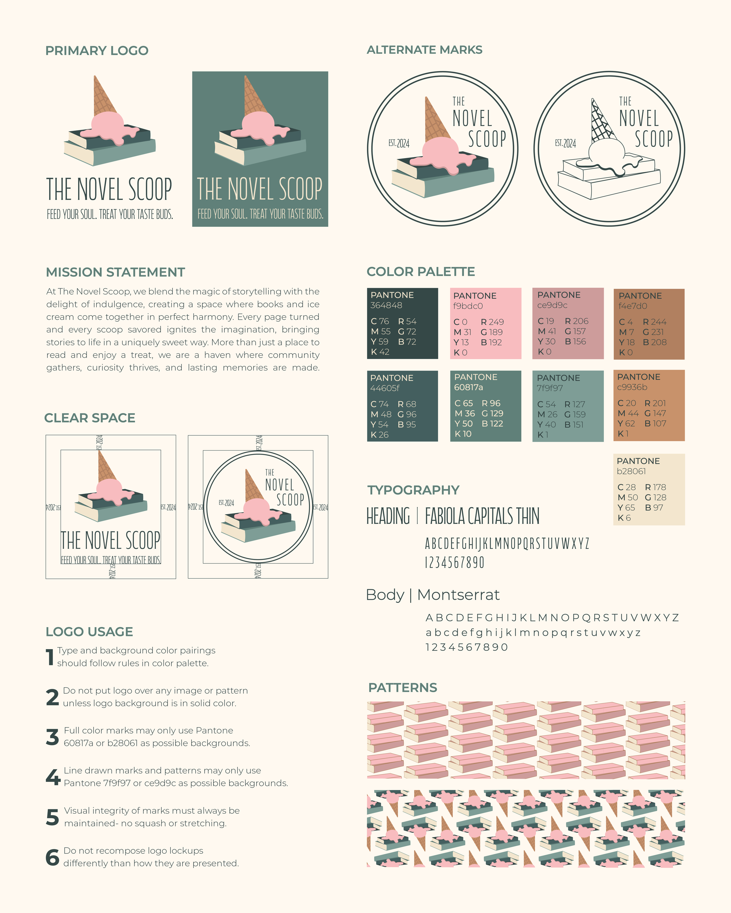
The Novel Scoop | Brand Identity
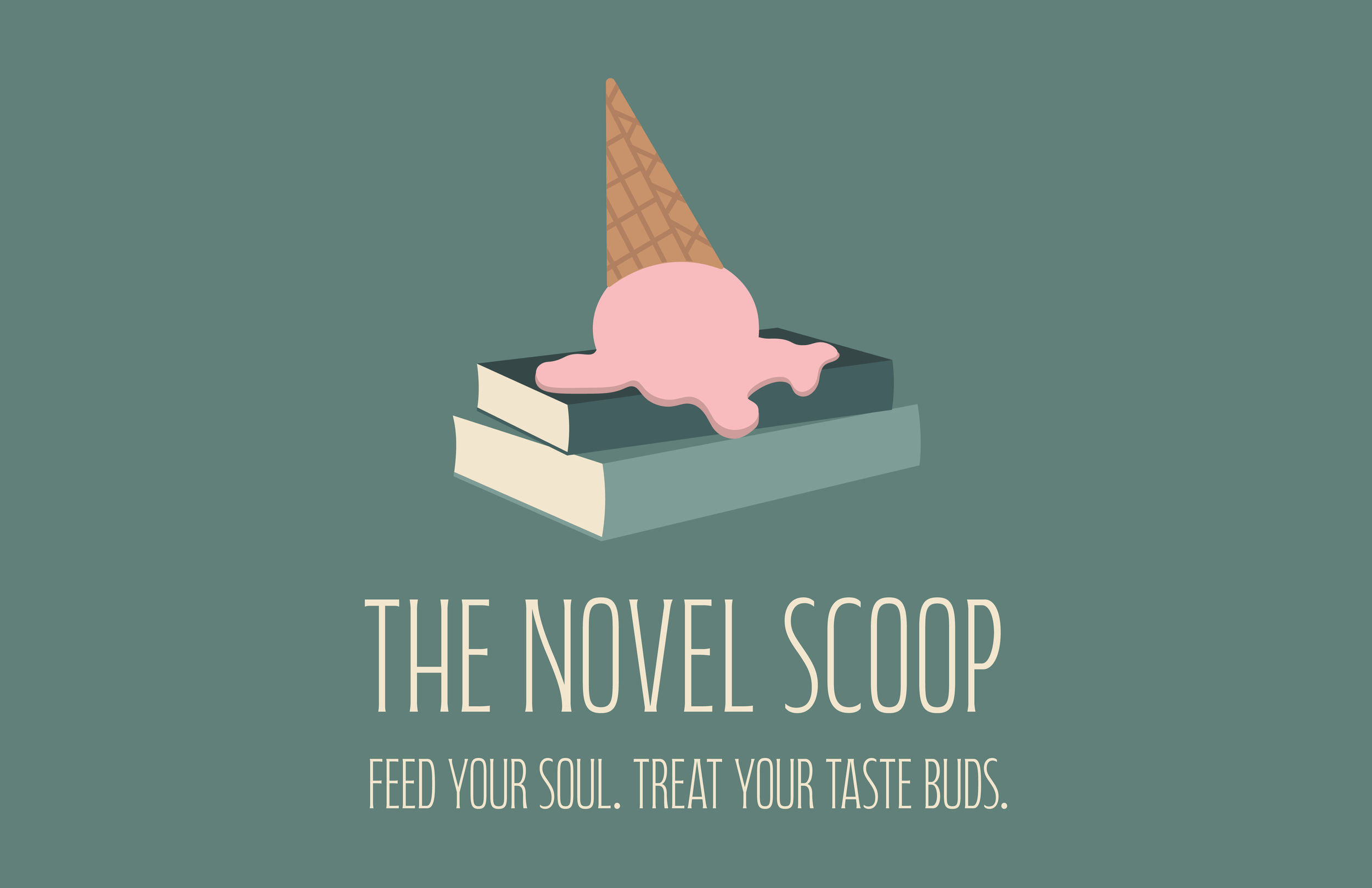
This project focused on developing a cohesive branding package for a fictitious restaurant, including a logo, color palette, typography, and collateral. My goal was to create an illustrative yet balanced logo that maintained clarity without being overly decorative. Careful consideration was given to color choices to ensure a refined and harmonious palette. Through class critiques, I selected Concept 32 for further refinement and ultimately chose Fabiola Capitols Thin as the typeface. Recognizing that the original brand name was too long for effective design, I revised it to enhance usability. I also explored alternative compositions for the illustration and adapted the design for versatility across various applications. To further establish the brand identity, I developed two patterns and alternative collateral forms, ensuring visual consistency across different media. The final stage involved fine-tuning design elements and applying them to collateral that reflected the restaurant’s unique blend. The project culminated in a comprehensive spread showcasing the primary and alternate logos, color palette, and collateral applications.
Brand Guidelines
Collateral


Initial Ideation & Exploration

View my full process work here.
Art Director: Scott Gladd
Designer: Emily Barca
Institution: PennWest University, Edinboro, PA